Balkinization
an unanticipated consequence of
Jack M. Balkin
Balkinization Symposiums: A Continuing List
E-mail:
Jack Balkin:
jackbalkin at yahoo.com
Bruce Ackerman
bruce.ackerman at yale.edu
Ian Ayres
ian.ayres at yale.edu
Corey Brettschneider
corey_brettschneider at brown.edu
Mary Dudziak
mary.l.dudziak at emory.edu
Joey Fishkin
joey.fishkin at gmail.com
Heather Gerken heather.gerken at yale.edu
Abbe Gluck abbe.gluck at yale.edu
Mark Graber
mgraber at law.umaryland.edu
Stephen Griffin
sgriffin at tulane.edu
Jonathan Hafetz
jonathan.hafetz at shu.edu
Jeremy Kessler
jkessler at law.columbia.edu
Andrew Koppelman
akoppelman at law.northwestern.edu
Marty Lederman
msl46 at law.georgetown.edu
Sanford Levinson
slevinson at law.utexas.edu
David Luban
david.luban at gmail.com
Gerard Magliocca
gmaglioc at iupui.edu
Jason Mazzone
mazzonej at illinois.edu
Linda McClain
lmcclain at bu.edu
John Mikhail
mikhail at law.georgetown.edu
Frank Pasquale
pasquale.frank at gmail.com
Nate Persily
npersily at gmail.com
Michael Stokes Paulsen
michaelstokespaulsen at gmail.com
Deborah Pearlstein
dpearlst at yu.edu
Rick Pildes
rick.pildes at nyu.edu
David Pozen
dpozen at law.columbia.edu
Richard Primus
raprimus at umich.edu
K. Sabeel Rahmansabeel.rahman at brooklaw.edu
Alice Ristroph
alice.ristroph at shu.edu
Neil Siegel
siegel at law.duke.edu
David Super
david.super at law.georgetown.edu
Brian Tamanaha
btamanaha at wulaw.wustl.edu
Nelson Tebbe
nelson.tebbe at brooklaw.edu
Mark Tushnet
mtushnet at law.harvard.edu
Adam Winkler
winkler at ucla.edu
Compendium of posts on Hobby Lobby and related cases
The Anti-Torture Memos: Balkinization Posts on Torture, Interrogation, Detention, War Powers, and OLC
The Anti-Torture Memos (arranged by topic)
Recent Posts
We're experimenting with expandable post summaries
Just A Few Blogs
ACS Blog
Alas, a Blog
Althouse
Arts and Letters Daily
Atrios (Eschaton)
Bill of Health
Buzzflash.com
Buzz Machine
Cato at Liberty
Juan Cole (Informed Comment)
Concurring Opinions
The Constitution in 2020
Corrente
Crooked Timber
Daily Howler
Daily Kos
Dana Boyd
Brad DeLong
Digby (Hullabaloo)
Discriminations
Daniel Drezner
Kevin Drum (Mother Jones)
Electrolite
En Banc
Eunomia (Daniel Larison)
Fafblog
Michael Froomkin (Discourse.net)
GovLab (Beth Noveck)
Rick Hasen (Election Law)
History News Network
How Appealing
Ignatz (Sam Heldman)
The Importance of (Ernie Miller)
Infolaw
Instapundit
International Economic Law and Policy Blog
IntLawGrrls
Jacob Levy
Jesus' General
Jurisdynamics
The Kitchen Cabinet
Mark Kleiman
Law Blog Central
Larry Lessig
Lawyers, Guns and Money
Liberal Oasis
Brian Leiter's Law School Reports
The Leiter Reports
Marginal Revolution
Megan McArdle
Memeorandum
Metafilter
Mirror of Justice
The New Republic
Newseum
No More Mister Nice Blog
Brendan Nyhan
Opinio Juris
Orcinus
The Originalism Blog
Pandagon
Passport (Foreign Policy)
Overcoming Bias
Political Animal (Washington Monthly)
Political Theory Daily Review
Political Wire (Taegan Goddard)
The Poor Man
Virginia Postrel
Prawfsblawg
Public Reason
Jonathan Rauch
Raw Story
Redstate
ReligiousLeftLaw.com
Reporters Committee For Freedom of the Press
Reproductive Rights Blog
Rothman's Roadmap to the Right of Publicity
SCOTUS Blog
Seeing the Forest
Clay Shirky
The Shifted Librarian
The Situationist
Larry Solum (Legal Theory)
Andrew Sullivan
Talking Points Memo
Talk Left
Tapped
Tbogg
TechPresident
The Paper Chase (Jurist)
Tom Paine
Tom Tomorrow (This Modern World)
Eve Tushnet
Uggabugga
University of Chicago Law School Faculty Blog
Unqualified Offerings
The Volokh Conspiracy
War and Piece (Laura Rozen)
Wampum
Oliver Willis
Wonkette
Written Description
Matthew Yglesias
Yin
Your Choice of Feeds
1. XML
powered by
2. Atom Feed
3. RSS 2.0
Friday, January 11, 2008
We're experimenting with expandable post summaries
JB
Many readers have asked for only the first few paragraphs of posts to appear on the main page of the blog instead of the full articles, which are often quite long, and so we are experimenting with some code that will do this. As a result, you will be able to see more of the recent posts without having to scroll down a great deal.
Please bear with us and let us know how you like it.
The one drawback of the new code is that all posts, no matter how short will end with the words, "continue reading ...." on the front page. There are workarounds to that problem, but we haven't been able to get them to work yet. Blogger's help desk maddeningly and unhelpfully says that "Modifying this feature is left as an exercise for the reader." Normally the goal of a help page is to help users, not to confuse them further. Perhaps this is part of a social science experiment on Blogger's part to see how mad it can make its users before they switch to Wordpad.
Posted
12:35 AM
by JB [link]
Comments:
the specific language "left as an exercise for the reader" is a geek joke, see http://www.faqs.org/docs/jargon/E/exercise-left-as-an.html
What the people who wrote the help docs probably meant was "don't muck around with this stuff unless you know what you are doing" or possibly "if you're reading these docs, you too much be a geek, because only other geeky people are this knee-deep in CSS and conditional tags, and you'll think this is amusing, not weird and obfuscating."
I thought it was amusing, but then again, I'm a geek. (Can't help on that specific issue though, not quite my area of geekitude, and have other exercises for the reader to do.)
I actually prefer your current method showing the full article. I can scroll down to see if it is a long article, which I might leave until I have more time for it, and I can see all your topics in the list on the left. I also do not need to switch pages back and forth to move on to different articles. With the change you propose, I will lose all this. Overall, not an improvement, IMHO.
I also prefer the current method. I use Bloglines to stay current with blog postings. I prefer reading everything in one place, with as few page changes as possible.
With the new approach, the intro for each post is too short. My interest doesn't get piqued enough. If that problem cannot be fixed, then I don't think the trade-off is worth it.
Just wanted to add my 2 cents-prevents me from skimming. I usually sit down and read all the postings weekly just before Happy Hour at the law school, and I just skim down them. I can't do that now :'(
My blog service is the same as yours -- Blogger.com -- and "expandable post summaries" is one of my favorite features. This feature makes scrolling through the posts much faster, and you are less likely to miss a post when scrolling through them. The "summaries" -- I prefer to call them "introductions" because they are often not really summaries -- can be made as long as necessary to be good introductions to the posts. This feature also makes loading of the home and archive pages faster for those with slow dial-up connections. The post list in the sidebar is not adequate because there are no introductions.
>>>>>> The one drawback of the new code is that all posts, no matter how short will end with the words, "continue reading ...." on the front page. <<<<<<<
That is no real problem once you get used to it. Also, saying "continue reading . . . " (or something similar) is actually appropriate if there are comments attached, and on this blog most posts eventually have comments attached.
Another Blogger.com feature I really like is "post labels." These are categories that you can assign to different posts, e.g., Freedom of Speech, Commerce Clause, etc.. I see that you are starting to use these labels -- your post "Hillary's Tears" has the label "emotion and cognition." LOL These labels help bloggers as well as visitors find posts in specific categories. It is a little difficult listing the post labels in the sidebar if you are still using the old "template" mode of Blogger.com (which also has a "layout" mode) -- you have to modify the template coding. If you tell me who manages your blog's software, I could email advice on how to manage the post labels.
One feature I really miss is a list of the most recent comments posted anywhere on the blog. I have not figured out how to create this. Blogger.com is not user-friendly.
BTW, whatever happened to Part 3 of the Fairness Doctrine series? I have already forgotten what I wanted to say on it.
Did enabling post summaries make them obligatory? Take Brian's post on "What is law?" What's the point of "continue reading" when EVERYTHING is, as they say, "above the fold"?
I do, however, endorse the use of post summaries for long posts; They make the site easier to navigate.
Post a Comment
I do, however, endorse the use of post summaries for long posts; They make the site easier to navigate.
Books by Balkinization Bloggers

Gerard N. Magliocca, The Actual Art of Governing: Justice Robert H. Jackson's Concurring Opinion in the Steel Seizure Case (Oxford University Press, 2025)

Linda C. McClain and Aziza Ahmed, The Routledge Companion to Gender and COVID-19 (Routledge, 2024)

David Pozen, The Constitution of the War on Drugs (Oxford University Press, 2024)

Jack M. Balkin, Memory and Authority: The Uses of History in Constitutional Interpretation (Yale University Press, 2024)
Mark A. Graber, Punish Treason, Reward Loyalty: The Forgotten Goals of Constitutional Reform after the Civil War (University of Kansas Press, 2023)
Jack M. Balkin, What Roe v. Wade Should Have Said: The Nation's Top Legal Experts Rewrite America's Most Controversial Decision - Revised Edition (NYU Press, 2023)

Andrew Koppelman, Burning Down the House: How Libertarian Philosophy Was Corrupted by Delusion and Greed (St. Martin’s Press, 2022)

Gerard N. Magliocca, Washington's Heir: The Life of Justice Bushrod Washington (Oxford University Press, 2022)
Joseph Fishkin and William E. Forbath, The Anti-Oligarchy Constitution: Reconstructing the Economic Foundations of American Democracy (Harvard University Press, 2022)
Mark Tushnet and Bojan Bugaric, Power to the People: Constitutionalism in the Age of Populism (Oxford University Press 2021).

Mark Philip Bradley and Mary L. Dudziak, eds., Making the Forever War: Marilyn B. Young on the Culture and Politics of American Militarism Culture and Politics in the Cold War and Beyond (University of Massachusetts Press, 2021).

Jack M. Balkin, What Obergefell v. Hodges Should Have Said: The Nation's Top Legal Experts Rewrite America's Same-Sex Marriage Decision (Yale University Press, 2020)

Frank Pasquale, New Laws of Robotics: Defending Human Expertise in the Age of AI (Belknap Press, 2020)

Jack M. Balkin, The Cycles of Constitutional Time (Oxford University Press, 2020)

Mark Tushnet, Taking Back the Constitution: Activist Judges and the Next Age of American Law (Yale University Press 2020).

Andrew Koppelman, Gay Rights vs. Religious Liberty?: The Unnecessary Conflict (Oxford University Press, 2020)

Ezekiel J Emanuel and Abbe R. Gluck, The Trillion Dollar Revolution: How the Affordable Care Act Transformed Politics, Law, and Health Care in America (PublicAffairs, 2020)

Linda C. McClain, Who's the Bigot?: Learning from Conflicts over Marriage and Civil Rights Law (Oxford University Press, 2020)
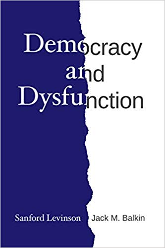
Sanford Levinson and Jack M. Balkin, Democracy and Dysfunction (University of Chicago Press, 2019)

Sanford Levinson, Written in Stone: Public Monuments in Changing Societies (Duke University Press 2018)

Mark A. Graber, Sanford Levinson, and Mark Tushnet, eds., Constitutional Democracy in Crisis? (Oxford University Press 2018)

Gerard Magliocca, The Heart of the Constitution: How the Bill of Rights became the Bill of Rights (Oxford University Press, 2018)

Cynthia Levinson and Sanford Levinson, Fault Lines in the Constitution: The Framers, Their Fights, and the Flaws that Affect Us Today (Peachtree Publishers, 2017)

Brian Z. Tamanaha, A Realistic Theory of Law (Cambridge University Press 2017)

Sanford Levinson, Nullification and Secession in Modern Constitutional Thought (University Press of Kansas 2016)

Sanford Levinson, An Argument Open to All: Reading The Federalist in the 21st Century (Yale University Press 2015)

Stephen M. Griffin, Broken Trust: Dysfunctional Government and Constitutional Reform (University Press of Kansas, 2015)

Frank Pasquale, The Black Box Society: The Secret Algorithms That Control Money and Information (Harvard University Press, 2015)

Bruce Ackerman, We the People, Volume 3: The Civil Rights Revolution (Harvard University Press, 2014)
Balkinization Symposium on We the People, Volume 3: The Civil Rights Revolution

Joseph Fishkin, Bottlenecks: A New Theory of Equal Opportunity (Oxford University Press, 2014)

Mark A. Graber, A New Introduction to American Constitutionalism (Oxford University Press, 2013)

John Mikhail, Elements of Moral Cognition: Rawls' Linguistic Analogy and the Cognitive Science of Moral and Legal Judgment (Cambridge University Press, 2013)

Gerard N. Magliocca, American Founding Son: John Bingham and the Invention of the Fourteenth Amendment (New York University Press, 2013)

Stephen M. Griffin, Long Wars and the Constitution (Harvard University Press, 2013)

Andrew Koppelman, The Tough Luck Constitution and the Assault on Health Care Reform (Oxford University Press, 2013)

James E. Fleming and Linda C. McClain, Ordered Liberty: Rights, Responsibilities, and Virtues (Harvard University Press, 2013)
Balkinization Symposium on Ordered Liberty: Rights, Responsibilities, and Virtues

Andrew Koppelman, Defending American Religious Neutrality (Harvard University Press, 2013)

Brian Z. Tamanaha, Failing Law Schools (University of Chicago Press, 2012)

Sanford Levinson, Framed: America's 51 Constitutions and the Crisis of Governance (Oxford University Press, 2012)

Linda C. McClain and Joanna L. Grossman, Gender Equality: Dimensions of Women's Equal Citizenship (Cambridge University Press, 2012)

Mary Dudziak, War Time: An Idea, Its History, Its Consequences (Oxford University Press, 2012)

Jack M. Balkin, Living Originalism (Harvard University Press, 2011)

Jason Mazzone, Copyfraud and Other Abuses of Intellectual Property Law (Stanford University Press, 2011)

Richard W. Garnett and Andrew Koppelman, First Amendment Stories, (Foundation Press 2011)

Jack M. Balkin, Constitutional Redemption: Political Faith in an Unjust World (Harvard University Press, 2011)

Gerard Magliocca, The Tragedy of William Jennings Bryan: Constitutional Law and the Politics of Backlash (Yale University Press, 2011)

Bernard Harcourt, The Illusion of Free Markets: Punishment and the Myth of Natural Order (Harvard University Press, 2010)

Bruce Ackerman, The Decline and Fall of the American Republic (Harvard University Press, 2010)
Balkinization Symposium on The Decline and Fall of the American Republic

Ian Ayres. Carrots and Sticks: Unlock the Power of Incentives to Get Things Done (Bantam Books, 2010)

Mark Tushnet, Why the Constitution Matters (Yale University Press 2010)
Ian Ayres and Barry Nalebuff: Lifecycle Investing: A New, Safe, and Audacious Way to Improve the Performance of Your Retirement Portfolio (Basic Books, 2010)
.jpg)
Jack M. Balkin, The Laws of Change: I Ching and the Philosophy of Life (2d Edition, Sybil Creek Press 2009)

Brian Z. Tamanaha, Beyond the Formalist-Realist Divide: The Role of Politics in Judging (Princeton University Press 2009)
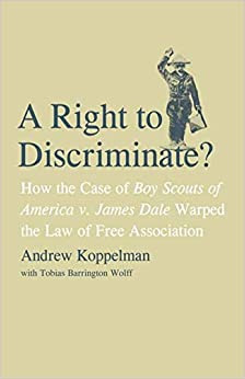
Andrew Koppelman and Tobias Barrington Wolff, A Right to Discriminate?: How the Case of Boy Scouts of America v. James Dale Warped the Law of Free Association (Yale University Press 2009)

Jack M. Balkin and Reva B. Siegel, The Constitution in 2020 (Oxford University Press 2009)
Heather K. Gerken, The Democracy Index: Why Our Election System Is Failing and How to Fix It (Princeton University Press 2009)

Mary Dudziak, Exporting American Dreams: Thurgood Marshall's African Journey (Oxford University Press 2008)

David Luban, Legal Ethics and Human Dignity (Cambridge Univ. Press 2007)

Ian Ayres, Super Crunchers: Why Thinking-By-Numbers is the New Way to be Smart (Bantam 2007)

Jack M. Balkin, James Grimmelmann, Eddan Katz, Nimrod Kozlovski, Shlomit Wagman and Tal Zarsky, eds., Cybercrime: Digital Cops in a Networked Environment (N.Y.U. Press 2007)
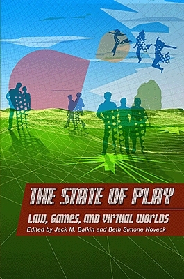
Jack M. Balkin and Beth Simone Noveck, The State of Play: Law, Games, and Virtual Worlds (N.Y.U. Press 2006)

Andrew Koppelman, Same Sex, Different States: When Same-Sex Marriages Cross State Lines (Yale University Press 2006)
Brian Tamanaha, Law as a Means to an End (Cambridge University Press 2006)
Sanford Levinson, Our Undemocratic Constitution (Oxford University Press 2006)
Mark Graber, Dred Scott and the Problem of Constitutional Evil (Cambridge University Press 2006)
Jack M. Balkin, ed., What Roe v. Wade Should Have Said (N.Y.U. Press 2005)
Sanford Levinson, ed., Torture: A Collection (Oxford University Press 2004)
Balkin.com homepage
Bibliography
Conlaw.net
Cultural Software
Writings
Opeds
The Information Society Project
BrownvBoard.com
Useful Links
Syllabi and Exams

